
To produce colour in offset printing there are two options:
Inks can be mixed to a certain colour and applied to the paper or different amounts of the four basic colours can be applied in different quantities on the paper to create a large number of colours.
This is the difference between special (or spot) colours and process colours: special colours are mixed before printing to exactly the colour specified whereas process colours are mixed on the press from cyan, magenta, yellow and black (CMYK).
Why does that matter?
This is important because, while we can simulate many colours and print pictures by using the process colours cyan, magenta, yellow and black, some colours cannot be produced accurately in this way.
If you need to reproduce a certain colour, say a corporate colour in a logo, it may be appropriate to choose to print this colour as a premixed ink, a special colour. This will most likely make your print job more expensive, especially if you are already using the process colour to print pictures and other colours, but it will guarantee, that your colour looks as expected.
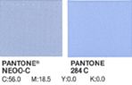
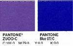
To decide which way to produce a colour and whether it is worth the extra expense it is always a good idea to check with the Pantone Solid to Process Specifier, a book or swatch in which special Pantone colours are compared to their equivalents in four colour process. Here it becomes obvious, that while some colours are quite close, other colours just can’t be matched successfully from combining cyan, magenta, yellow and black.
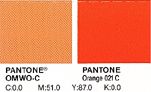 Orange (Pantone 021) is notorious for creating disappointment when matched in CMYK.
The colour on the left represents orange printed in 4 colour process, whereas the orange on the right is the premixed ink.
There are many other colours which can be difficult to reproduce in 4 colour process.